Feel the rush.
Total Product Expo 2026
TPE has always been a trade show, but the audience had changed. Tobacco and cigars gave way to vape and alternative smoke products, and with them came a new generation of exhibitors and attendees rooted in tech, culture, and forward momentum. The event needed a concept that could speak to that energy. Something that did not just inform people about the show but made them feel something about attending it.
Illustration system
Photography Direction
Video Direction
AI Prompt Engineering
Modular Emails
Concept Development
Copy Direction
Website Design
Design Systems
Environmental Design
The starting point.
Every year begins from zero. This one began with a vision.
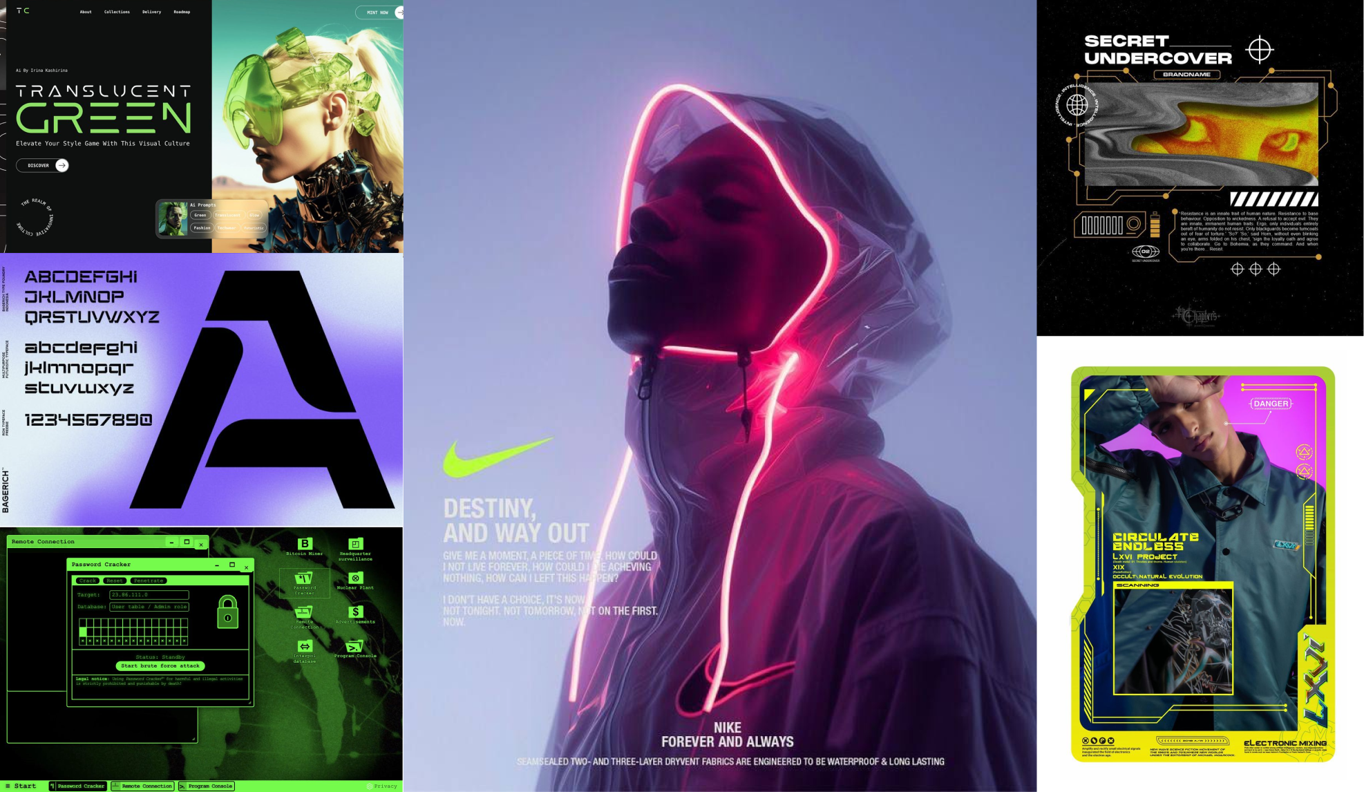
Trade show event concepts do not carry over year to year. There is no visual legacy to protect and no brand equity to build on. The slate is wiped clean every cycle. What the previous site did was communicate information. What it could not do was create desire. Before a single asset was made, we had to define the emotional territory the new concept needed to own. The moodboard below was that starting point. A client alignment exercise that established the visual and emotional language before anything got built.
Setting the tone.
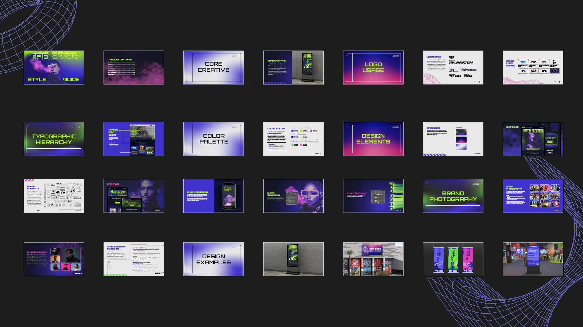
A complete style guide built to give every stakeholder the tools to maintain cohesion.
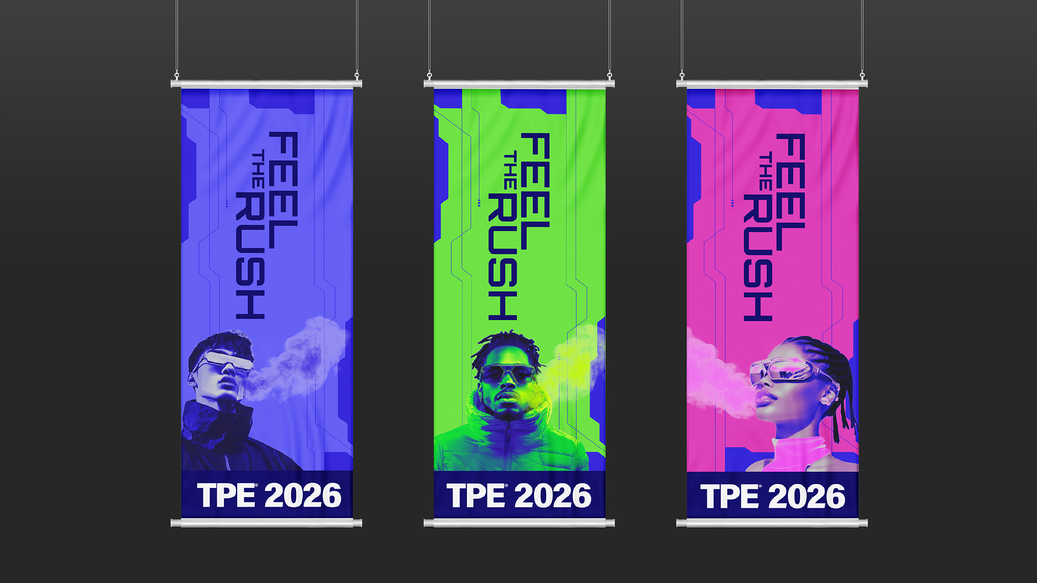
The style guide was not a rigid rule book. It was a living framework built to grow with the concept. Rigid enough to maintain cohesion across every vendor, partner, and internal team member. Flexible enough to prevent the creative from becoming repetitive or formulaic. It defined the ethos behind the concept, the illustration system, gradient usage, and decorative assets, color and logo standards, image treatment, AI imagery generation standards and prompt engineering guidelines, and lifestyle photography direction. A shared ecosystem that gave everyone the tools to stay on brand while still having room to explore.
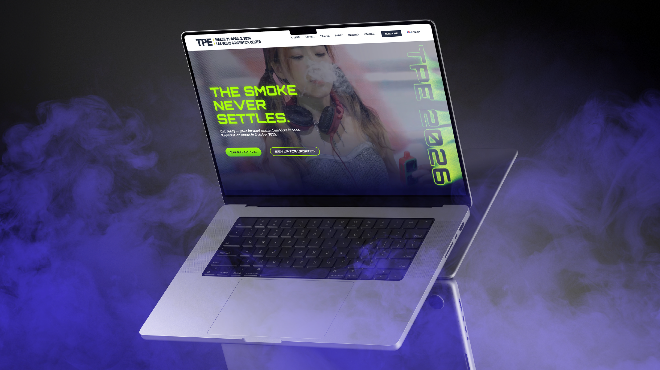
The digital experience.
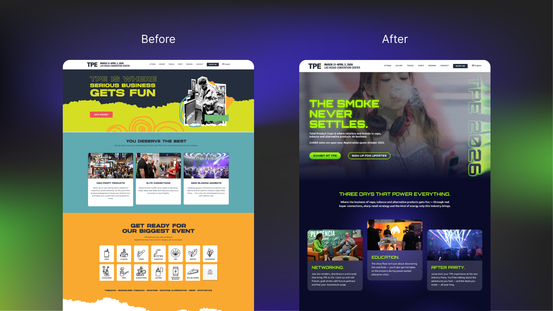
Built to create desire, not just communicate benefits.
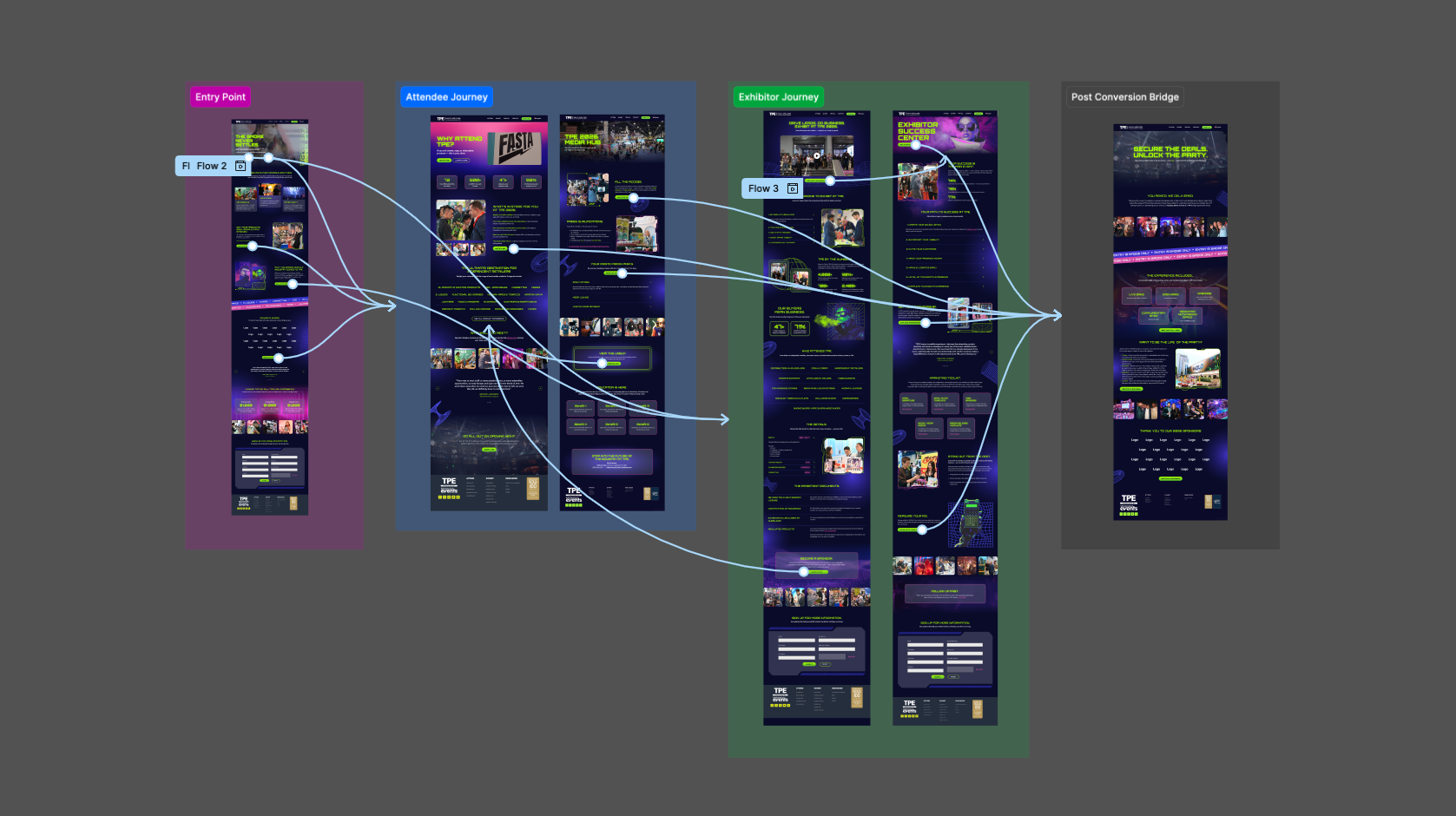
A full website redesign and WordPress build that translated the Feel the Rush concept across every page and interaction. The old site did the functional job of listing show information. The new site was designed to make someone who had never attended TPE feel like they were already missing out.
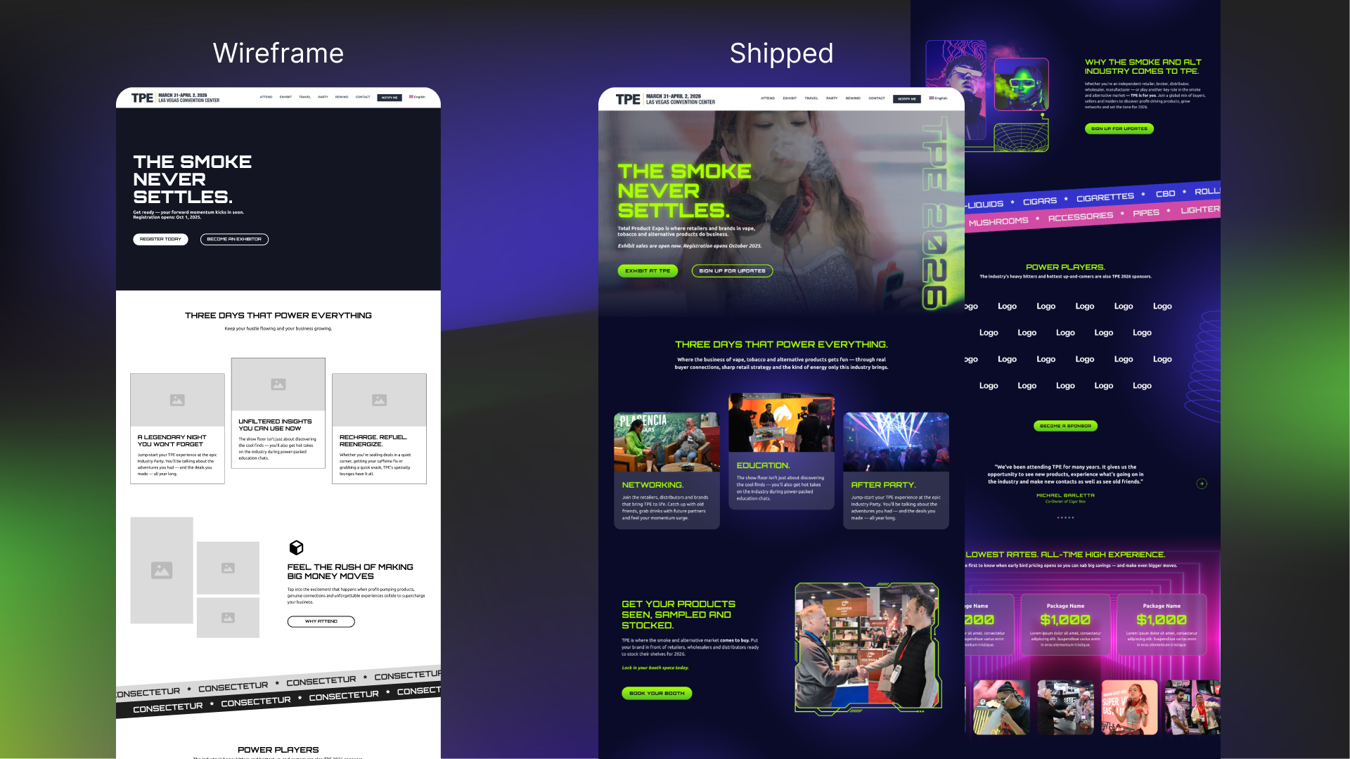
Every page started as a wireframe. Before color, before photography, before the concept's visual language was applied to a single element, the structure had to be right. Wireframes established the content hierarchy, the conversion logic, and the narrative arc of each audience journey, giving the client, copywriters, and marketing team a clear picture of how the site would work before anyone had to imagine it. It created alignment early and prevented the kind of feedback that derails a project late. Once the wireframes were approved the design phase had a solid foundation to build on, and once the design was finalized the developer handoff was clean, organized, and precise. No guesswork. No revision loops. Just a well-documented system that moved from concept to shipped without losing anything along the way.
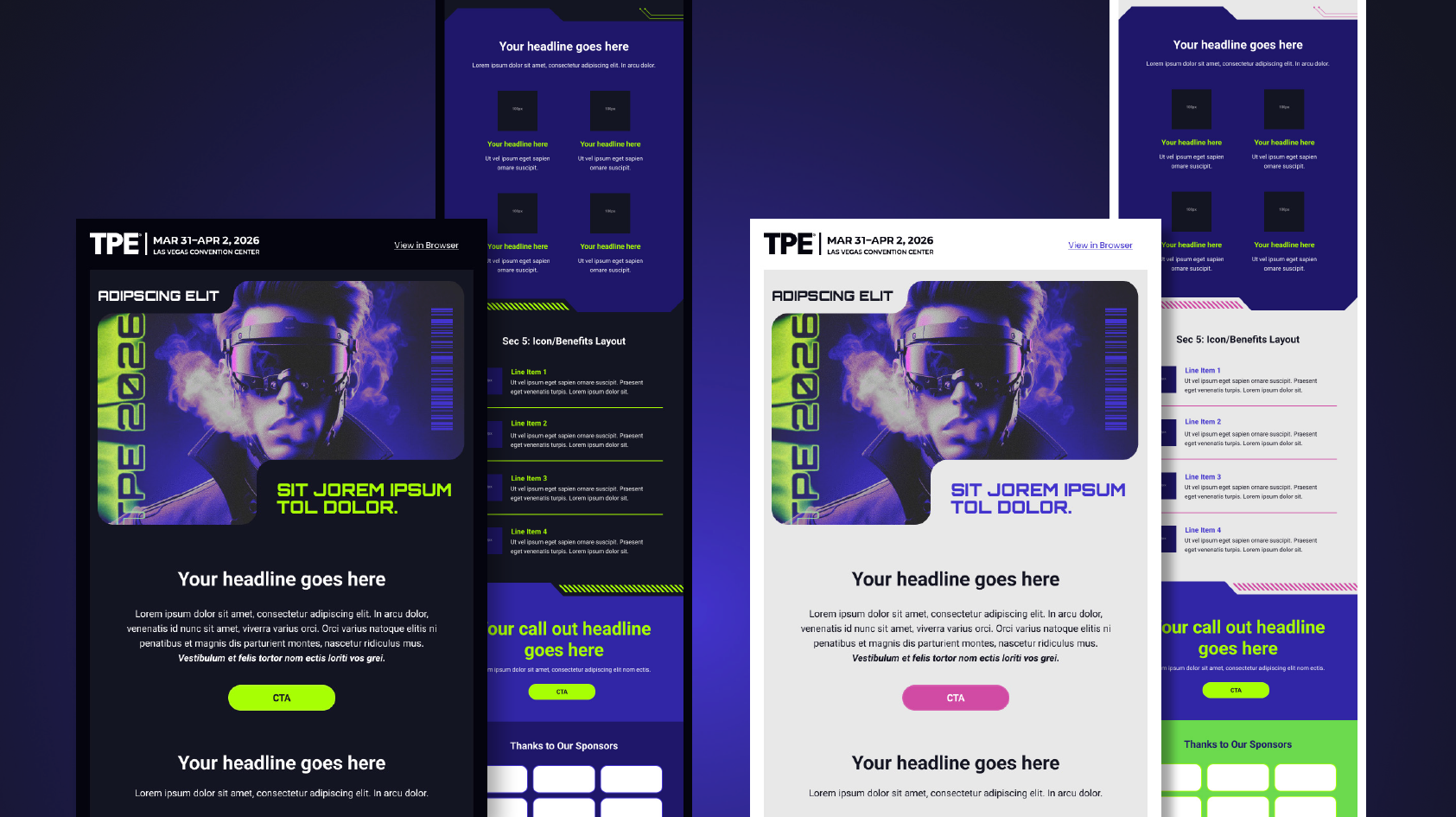
Email design built for scale.
A modular email template system designed for consistency, flexibility, and performance.
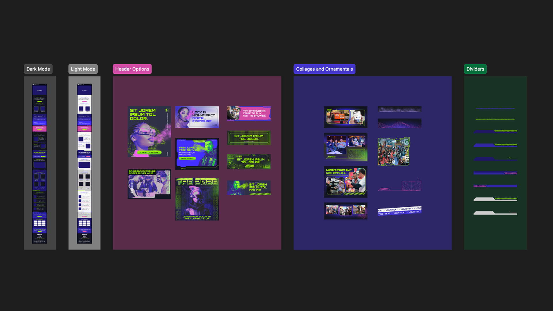
The template was not designed to be used in its entirety for every send. It was built to empower email marketers to treat each email as its own story, with a flexible library of section layouts, header variations, collage and ornamental options, and divider styles to choose from depending on the narrative. Built directly inside HubSpot's drag and drop builder, the system eliminated development dependencies, gave marketers the autonomy to execute independently, and reduced the creative team's role to image creation and QA review. Dark and light mode variations ensured accessibility and deliverability across operating system preferences without compromising the visual integrity of the concept. The results reflected the craft. Open rates averaged between 31% and 44% across the campaign, more than double the B2B email industry benchmark of 21%.
Show, don't tell.
From storyboard to screen. Every frame planned with intention.
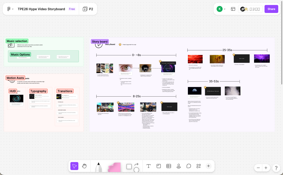
The storyboard defined the visual arc of the attendee acquisition video from opening moment to closing call to action, establishing the shot sequence, the copy beats, and the emotional pacing that would guide production. It gave the production team a clear creative brief to execute against and ensured that every decision made on set was intentional rather than improvised. The result was a video that did not just list what TPE offers but captured what it feels like to be there.
The concept brought to life.
From screen to show floor.
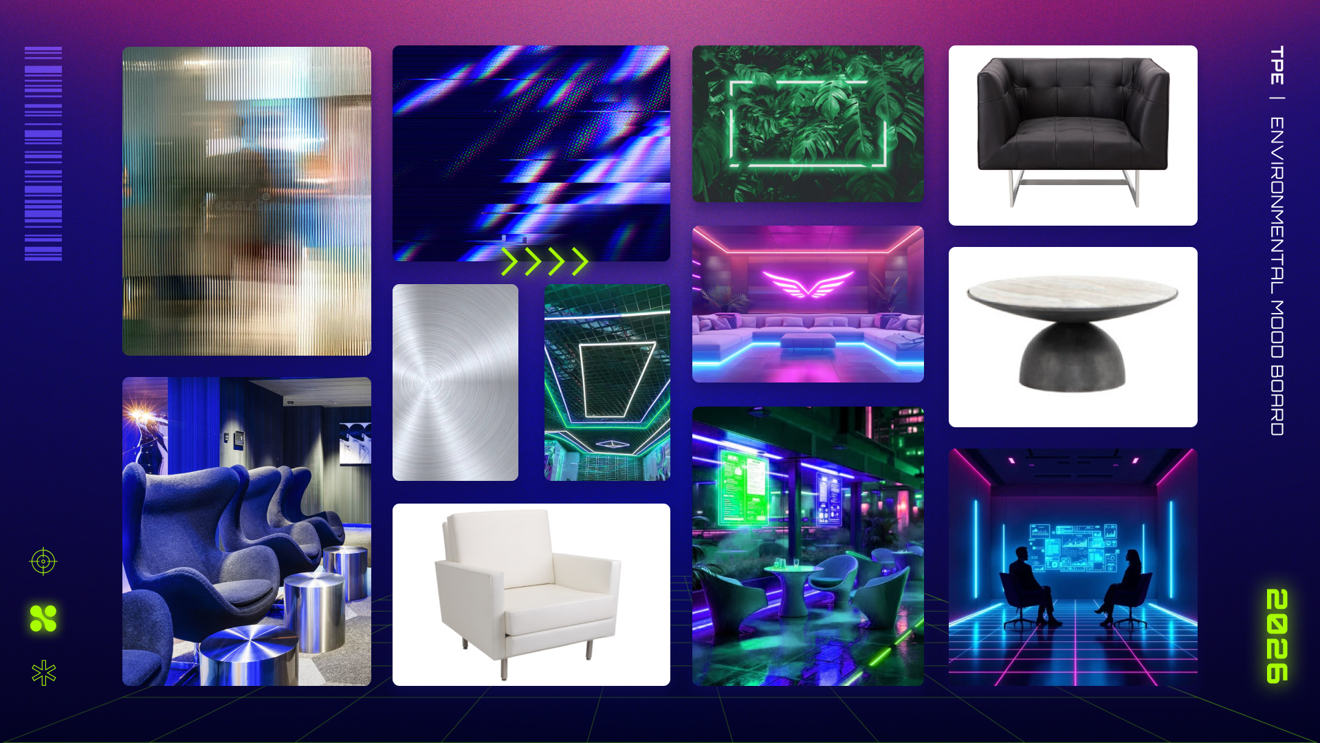
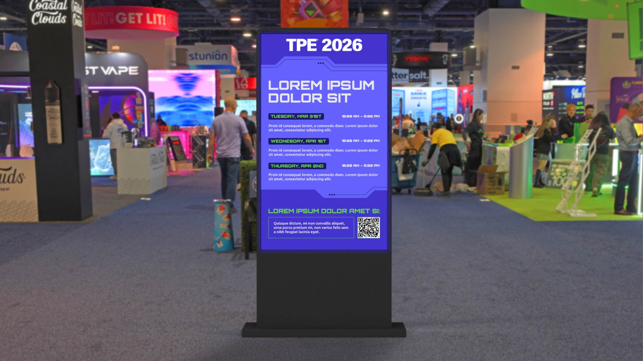
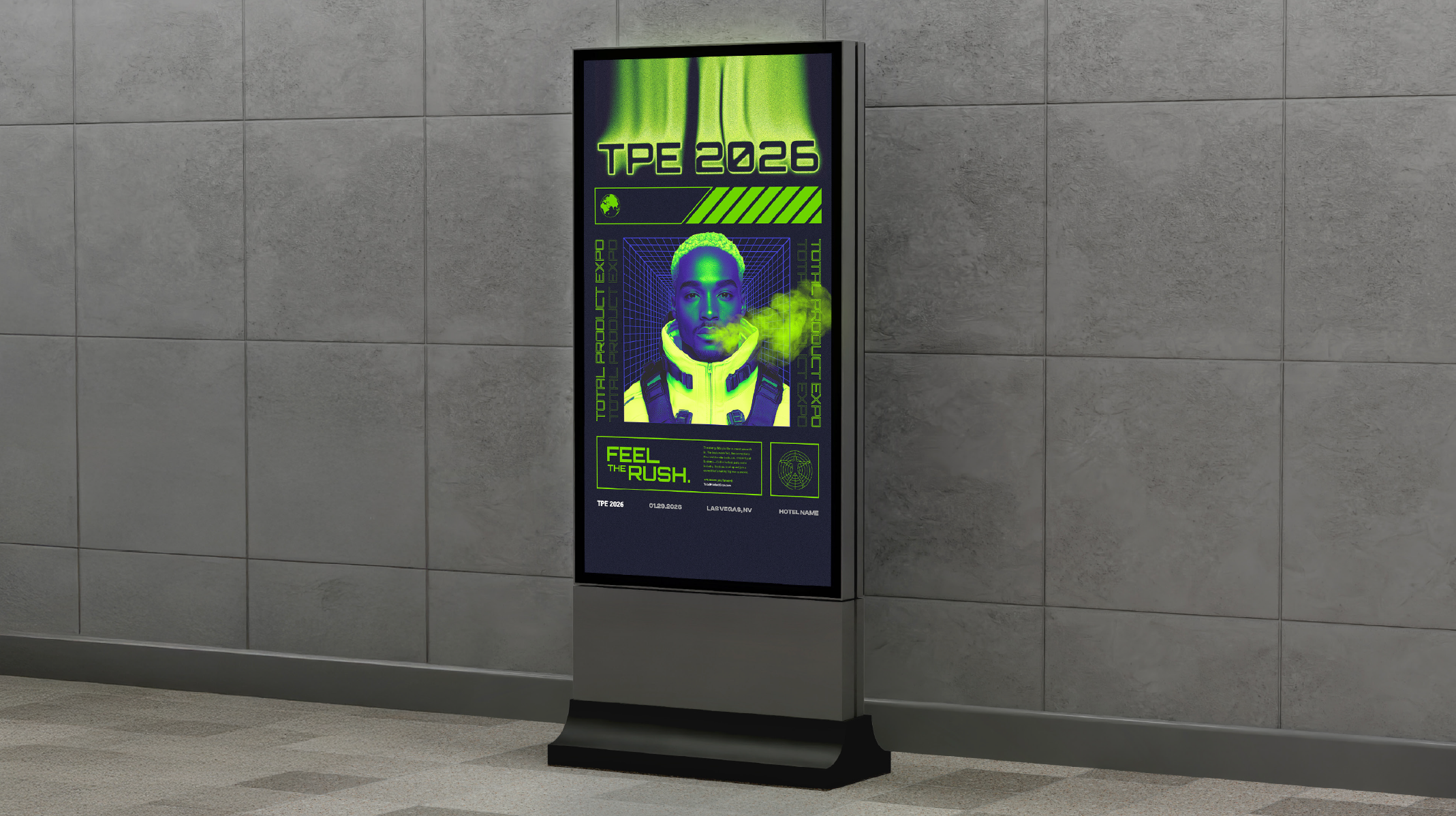
The concept did not stop at the screen. An environmental moodboard was created to give the onsite vendor clear direction on the physical world the concept needed to inhabit. Furniture selections, wall and divider textures, accent materials, lighting design, and installation ideas were all specified to ensure the Feel the Rush visual world was not just applied to graphics, but embedded into the physical environment itself. The goal was immersion, not decoration.
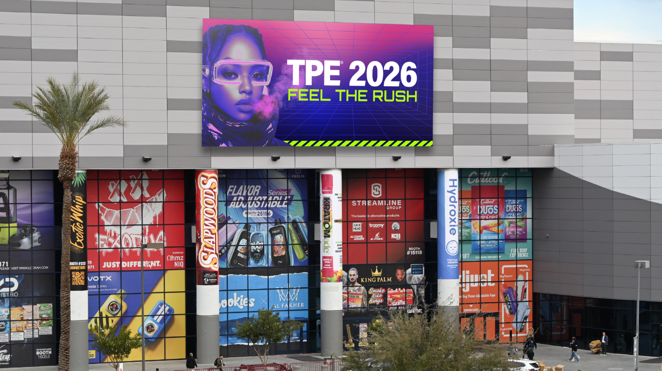
The signage system was designed with the same intentionality. A trade show floor is a sea of competing advertisements, conflicting brand colors, and visual noise from hundreds of vendors all fighting for the same attention. Standing out required more than bold design. It required a system. The concept's color palette was deployed strategically across the signage hierarchy, using high contrast combinations to cut through the visual clutter and read clearly against the venue's dark ceiling infrastructure. Every sign was considered as part of a cohesive wayfinding and brand experience, not a standalone asset. The result was a presence on the show floor that felt unified, purposeful, and unmistakably TPE.